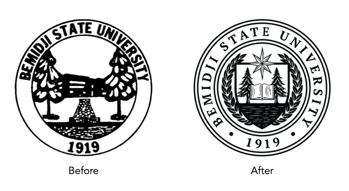
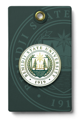
A comprehensive brand audit revealed a significant identity crisis for Bemidji State University (BSU). Statewide research indicated that prospective students and parents often confused the university’s logo with that of the City of Bemidji.
Key Issues
The word "Bemidji" dominated the wordmark, overshadowing "State" and "University."
The existing mark resembled a municipal or parks-and-recreation seal rather than an academic institution.
List ItemElements like trees and water, while local, are used by Minnesota corporations and schools, failing to create a unique "ownable" brand for BSU.
Elements like trees and water, while local, are used by Minnesota corporations and schools, failing to create a unique brand for BSU.
The project focused on transitioning from a regional mark to a distinct university brand that reflects its academic and athletic stature. While the university has deferred the full brand rollout due to shifting fiscal priorities, the three design directions remain the established blueprint for their future identity.
Concept 1: Modern Integration
This concept focuses on modernizing the typography and correcting the hierarchy. The Approach: Integrated the iconic pine trees directly into the logotype. The Result: By presenting “Bemidji State” as a unified, bold wordmark, the design ensures the university is recognized as a single entity rather than just a city location.
Concept 2: The Academic Shield
This direction leans into traditional collegiate “prestige” while retaining heritage elements. The Approach: Encapsulated the trees, water, and sunburst elements within a classic shield—a universal symbol for higher education. The Result: This unified “Bemidji” and “State” into a single cohesive badge, instantly elevating the institution’s perceived academic authority.
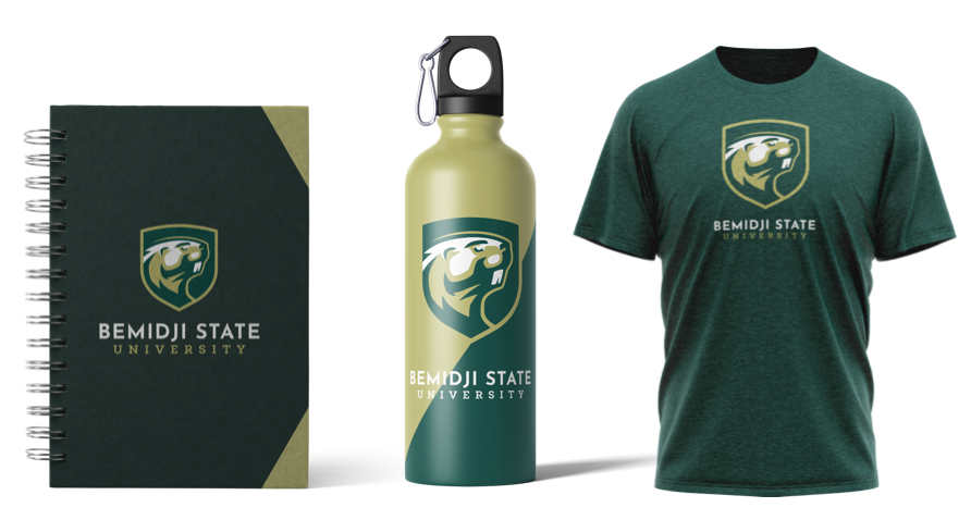
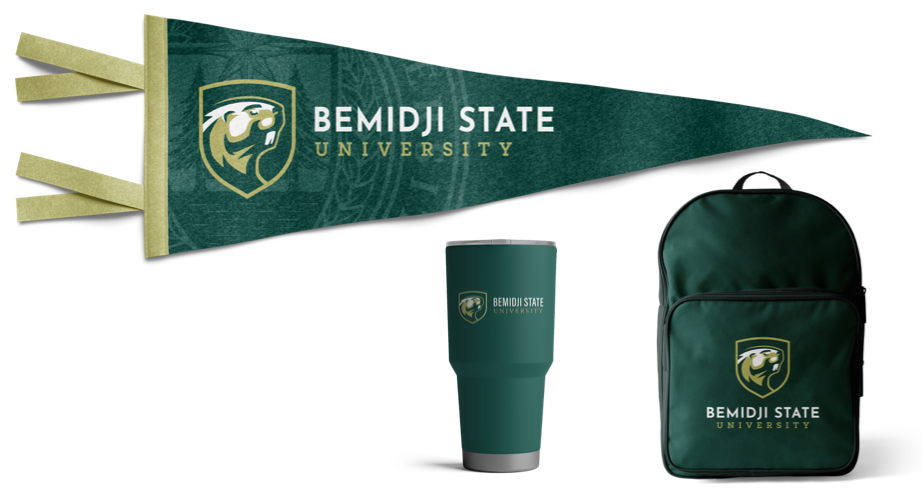
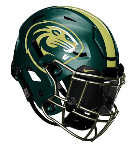
Concept 3: The Beaver Brand (Athletic & Academic Alignment)
Recognizing that the “Beaver” is a unique and high-equity symbol for BSU athletics, this concept explores moving away from generic nature symbols. The Approach: Utilized a stylized Beaver as the primary mark for both the university and athletics. The Result: This created a bold, unique identity that is unmistakably BSU. To maintain professionalism, we developed a specialized athletic uniform version to ensure a clear distinction between “classroom” and “competition” while keeping the brand under one umbrella.